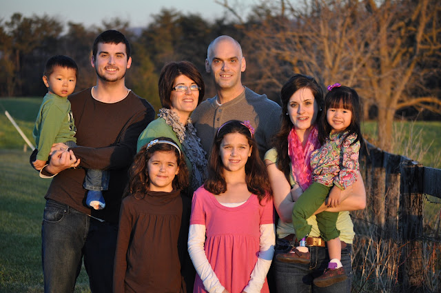
Kevin's parents' house offers a beautiful backdrop, so we thought we'd give it a whirl before Aaron left for boot camp.
I honestly think the pictures leading up to 'the picture' are hilarious. Perhaps a little more accurate portrayal of life in a large family than the final send-to-family-and-friends photo!
So here are some of the pictures before 'the picture'....
 |
| Anna Grace is ready to go! |
 |
| Now Ally is ready, too! Joshua is interested in his shirt. |
 |
| Oh, no! We're losing them. Aaron's expression says it all. |
 |
| Maybe a new location will help? No so sure...especially Anna Grace. |
So photographing a family, much less a fairly good-sized one, can be tricky. Although none of 'the pictures' are perfect, they could work for our Christmas cards (if I ever send them out!).
So, for all 3 of my readers (Hi Mom! and Mom M! and Emma!)...let's vote! I have my personal favorite of the next 3 photos but I can be swayed!!!
So, should we go with #1 "Standing by the Fence in Black & White"?
 |
| All 3 younger girls could have done better smiling. Love Joshua's 'rock on' expression! |
#2 "Standing by the Fence in Brown, Green, and Pink"?
 |
| Sun was a little bright...hence squinty eyes. Girls' expressions are better...Joshua's not so much. |
Or #3 "Black in the Field" {don't let my lack luster titles influence you!)
So, to vote...you have to leave a comment telling me which # picture you like best!!!
Or, I guess you can email me if you have my address!
So while you are mulling it over, I thought I'd share some of our sibling attempts.
Very few worked, although several had potential.
 |
| Anna Grace was D-O-N-E! |
 |
| Couldn't get them to look in the same direction. Still I like it! |
 |
| Lily looks a little stressed in this one...but still so sweet! |
And, this, though it slightly blurry from the exceptionally high ISO, is a be-still-this-mama's-beating-heart photo.
So go VOTE!
In Him,


Love the kissy one at the end but for the whole family photo, I like standing by the fence in black and white. #3 tends to make me think of the American Gothic for some reason.
ReplyDeleteThat's so funny! I see it now that you say it! Thanks for commenting!
DeleteI like #2, I look best in #2
ReplyDeleteMandy I think #3 is my favorite because the majority of the expressions are best in this photo but it is a little bit dark. I also like #2 even with the squinty eyes because the light is better in the photo and the faces are brighter because of it. But I love, love, love the one of Aaron and Joshua and the one of Lily and Joshua kissing… soo cute!
ReplyDeleteLast one is soooooo cute! pink and green one!
ReplyDeleteCan you lighten #3? If so that is my pick. Otherwise 2.
ReplyDelete